Wednesday 23 October 2013

Found Lettering and Site Specific Typography

I have started to look at ways of making a piece of typography relate to a particular site. I have looked at several artists to help with this process. Gillian Wearing asked people in the street to write their thoughts on paper and she photographed them in situ.


Richard Long references walks that he has made to create understated pieces of typography, that are laden with context.

Martin Creed (above) and Jaume Plensa (below) both create text to be displayed in specific locations. The interpretation of the text is governed by our relationship with the place and visa versa.


Simon Jennings created a book called 'Urban Types'. He photographed hundreds of letters from shop fronts, street signs and number plates. He also found 'accidental' lettering, man made or natural objects that formed incidental letter shapes. These could then be used as a normal type face.
Spanish Street artist Ripo, often uses mirrors to literally reflect the location of his typography-based artworks.


Letterpress and Politics

Letterpress has traditionally been used as a medium for political messages. The example below is by Desmond Jeffrey a printmaker of note from the 50/60s


The example above is from Ryan Hay, a contemporary Toronto based artist. The quote is from Civil Rights activist Angela Davis.

Avante Garde Typography

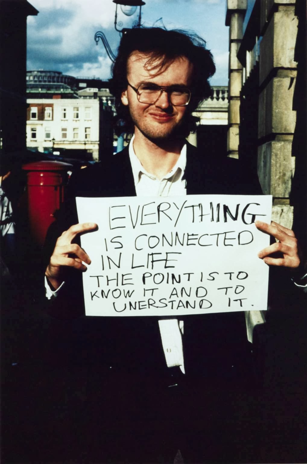
I decided to look at some uses of text without any imagery. Avante Garde design movements from the early 20th century seemed to be a good source. These radical designers developed the use of typography to reflect the revolutionary ideas that underpinned the whole ethos of their work.


Revolutionary Russia spawned Constructivism. Two of it's most influential designers were Alexander Rodchenko and El Lissitzky.


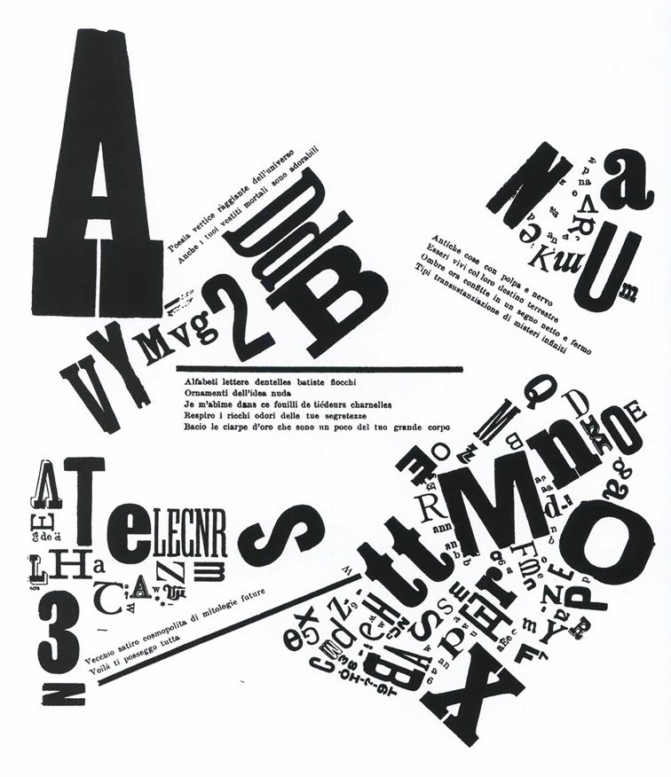
Filippo Tommaso Marinetti was a leading light of the Futurists. They had ideas about sweeping away anything from the past. This lack of respect for convention allowed him to subvert text in a completely new way.


Kurt Schwitters had links with Dada, but led his own one man art movement, Merz. He published a magazine that reflected the layout of his well known collage pieces.


The Bauhaus was a German art school that went on to inspire art and design teaching around the world. It was eventually closed by the Nazi's who thought the encouragement of free thinking to be a threat to their regime. Work above is by Herbert Bayer and Laszlo Moholy-Nagy.


De Stijl was a Dutch art movement that had many links with The Bauhaus . Paul Schuitema and Theo van Doesburg experimented with multi-directional type.

Monday 21 October 2013

Lino Cut Quote

I decided to take a quote from Edward Cadbury and reproduce it as a hand lettered lino cut. The first stage was to draft out the design. Next I transferred the design to a lino block (being careful to reverse it) and cut out the background. I printed it onto a photocopy of one of the Bill Brandt photos.


The print itself wasn't great as it was only done quickly at home rather than in the printroom, but the basic idea has some value, I feel.  I took the lino into the print room at Margaret Street and used the press there to produce a better quality print. I exposed some of the Bill Brandt images onto a screen and then tried overprinting the typography.


Friday 18 October 2013

Social Mobility and Child Poverty Commission


On the 17th October 2013, the Social Mobility and Child Poverty Commission published it's first annual report. It's Chair Alan Milburn (pictured left) delivered a speech outlining the Commissions findings and recommendations. Having discovered the writings of Edward Cadbury (pictured right) from the beginning of the 20th Century, I found the parallels very interesting. Here are a few excerpts from Milburn's speech, with quotes from Edward Cadbury in blue text :

"Today child poverty is overwhelmingly a problem facing working families, not the workless or the work-shy. Two-thirds of Britain’s poor children are now in families where an adult works. In three-quarters of those households someone already works full-time. The principal problem seems to be that those working parents simply do not earn enough to escape poverty."

"When the labourer cannot maintain himself at a reasonable standard of decency and comfort, the decline in industrial efficiency is rapid."

"Today the UK has one of the highest rates of low pay in the developed world. Five million workers, mainly women, earn less than the Living Wage."

"Reformers realise that something more radical than charity is needed, that soup kitchens and even doles by municipalities are not sufficient"

"The taxpayer alone can no longer afford to shoulder the burden of bridging the gap between earnings and prices. We conclude that Government will need to devise new ways of sharing that burden with employers in a way that is consistent with growing levels of employment. Making headway on reducing poverty and improving mobility requires a fresh settlement between what the state does, what the market does and what the citizen does."

"We must recognise that any trade that does not pay a living wage to its workers is a parasite on the community" 

"Employers will need to more actively step up to the plate. Our key recommendations are that, firstly, they will need to provide higher minimum levels of pay and better career prospects, enabled by higher skills. Secondly, we call on half of all firms to offer apprenticeships and work experience as part of a new effort to make it easier for those who aren’t going to university - “the other 50 per cent” - to pursue high quality vocational training. Thirdly, we call on the professions to to end unpaid internships and recruit from a broader cross-section of society than many do at present."

I find it somewhat depressing that we face the same issues 100 years later, and there are still voices airing their concerns and offering solutions, who will no doubt be ignored. The need to bow to that "unrestricted competition" that Cadbury warned about is still paramount for modern politicians. I wonder what would have happened if Edward Cadbury had been listened to?

Here are links to two related articles on the BBC News website. The first about the increase in the use of food banks, the second a report on Alan Milburn's speech.

Wednesday 16 October 2013

Visit to Library of Birmingham Archive

Yesterday evening, as part of our 'Photography and the Archive' module, we visited the Library of Birmingham Archive to see the original Bill Brandt photos from the Bournville Village Trust collection. Peter James explained how he rediscovered the images. There were also press cuttings and other documents for us to see. We were joined by students from the School of Architecture who are also going to respond to aspects of this theme in their work.


Adam Burton

Adam Burton is an artist who works with text and print. 'Acceptable Answers' was an exhibit that featured thirteen rubber stamped prints onto found greyboard. The piece was inspired by Cormac McCarthy's 'The Road' and dealt with concerns about climate change and economic collapse.

A two week residency and letterpress workshop in Cheltenham resulted in the work below. I particularly like the sight specific aspect of this project.


Tuesday 8 October 2013

Bob and Roberta Smith


Bob and Roberta Smith (real name Patrick Brill) is a contemporary artist who produces hand lettered artworks that make political and cultural comment. The brightly coloured statements often use humour to convey the message. Many of Bob and Roberta Smith's recent work has been targeting the government's policy of cutting arts funding and in particular Michael Gove's erosion of arts teaching in schools.


Locally you can see Bob and Roberta Smith's work at the New Art Gallery Walsall. The Epstein Archive Gallery is his response to the extensive collection of the sculptor's work held by the gallery.

Saturday 5 October 2013

Current Ideas for Photography and the Archive

I would like to use some of the quotes from Edward Cadbury and images from the Bournville Archives (see previous posts) to create artworks that use printmaking techniques such as letterpress and woodblock. The typography and layout could be inspired by some of the early Cadbury graphics.


Below are some other styles of both traditional and contemporary typography, illustration and print that could potentially be referenced.


Homes Fit For Heroes - Bill Brandt

Between 1939 and 1943, Bill Brandt undertook a commission from the Bournville Village Trust to photograph housing and living conditions in Birmingham. The images contrasted life in the 19th century built back-to-back slums of the inner city with the modern municipal housing built in the 1930s.


Brandt manipulated the composition and lighting to intensify the contrasts. The modern home is flooded with light and air, whilst the family eats good food, some of which will have been grown in their own garden. In the slum housing there is little light and the food on the table is meager, but Brandt is careful not to denigrate the family in any way, they are just as hard working and loving as the more fortunate parents. Interestingly Brandt had suffered from TB in his childhood and would have understood too well the importance of fresh air and sunlight.

The photographs were never used and lay undiscovered in the BVT archives for 60 years before going on display again in Birmingham.